
Contact our team for professional guidance and solutions.
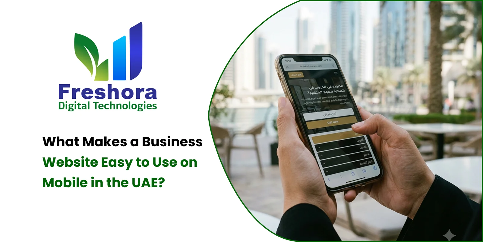
Mobile Web Design UAE focuses on creating websites that are easy to navigate, read, and use on smartphones before adapting them to larger screens. A mobile-friendly business website should load quickly, display readable content, provide accessible contact options, use touch-friendly buttons, and make important information easy to find. These features help customers interact with businesses more comfortably while supporting enquiries and conversions.
Smartphones have become an important way for customers to discover businesses, compare services, read reviews, and make purchasing decisions. In the UAE, where companies serve customers across different industries and communities, a website must provide a smooth experience regardless of the device being used. A desktop website that simply shrinks to fit a smaller screen may still create problems through tiny text, difficult navigation, slow loading, or complicated enquiry forms. Mobile usability requires a more deliberate approach that considers how people browse, what information they need first, and how easily they can complete an action. Businesses should prioritise the mobile experience during planning and development instead of treating it as a finishing touch. By combining responsive layouts, clear content, efficient performance, and convenient contact options, companies can create websites that help mobile visitors find information and connect with the business without unnecessary effort.
Mobile-first design is a development approach in which designers and developers plan the website experience for smaller screens before expanding it for tablets, laptops, and desktop computers. It encourages teams to identify the most important information and actions rather than attempting to fit every desktop element onto a smartphone display.
For example, a UAE-based business consultancy may have several service categories, company details, case studies, and downloadable resources. On a mobile screen, presenting everything at once can make the homepage difficult to understand. A mobile-first layout prioritises the main service message, a concise explanation, and an accessible enquiry option before presenting supporting details.
This approach involves several practical decisions:
Content prioritisation: Display the information visitors need most prominently and organise secondary details into logical sections.
Responsive layouts: Allow text, images, navigation, and other elements to adapt to different screen sizes.
Touch-friendly controls: Design buttons, links, menus, and form fields that are comfortable to use with a finger.
Performance planning: Limit unnecessary resources that can delay loading or make interactions feel sluggish.
Action-oriented structure: Make it easy for visitors to call, message, book, or submit an enquiry when appropriate.
The objective is not to remove useful content simply because a visitor uses a smartphone. It is to present that content in a structure that works naturally on a smaller screen.
Navigation strongly influences whether visitors can find the information they need. A menu that works well with a mouse may become frustrating when it contains too many items, small clickable areas, or several layers of nested options.
Effective mobile website navigation should help visitors move between important pages without confusion. Most business websites benefit from a clear menu containing essential destinations such as Home, Services, About, and Contact, with additional categories included only when they improve the experience.
Businesses can improve navigation by following these practices:
Use a clearly recognisable menu control and ensure that it opens and closes reliably.
Group related services under meaningful labels instead of displaying a long, unstructured list.
Keep important destinations easy to reach without excessive scrolling or repeated taps.
Make the active page and interactive states understandable.
Ensure that menus work with touch, keyboard navigation, and assistive technologies.
Avoid placing important links too close together, where accidental taps are more likely.
Consider a customer searching for office cleaning services in Dubai. If the website provides a clearly labelled Services menu with a direct link to commercial cleaning, the visitor can reach the relevant information quickly. If the same information is hidden inside several unclear categories, the customer may leave before discovering the service.
Website speed affects how quickly customers can access information and begin interacting with a business. A page containing large images, unnecessary scripts, excessive animations, or inefficient third-party tools may perform poorly on a smartphone, even when the design looks attractive on a desktop computer.
Mobile Website Design Dubai projects should consider performance during the development stage rather than relying entirely on later optimisation.
Important improvements include:
Compress images and use modern formats such as WebP or AVIF where appropriate.
Serve images at dimensions suitable for the device instead of downloading oversized files.
Minimise unnecessary JavaScript and CSS while preserving functionality.
Use browser caching and appropriate server-side caching where suitable.
Load below-the-fold images efficiently without delaying essential content.
Review third-party scripts, tracking tools, chat widgets, and embedded media.
Test the website on different devices and network conditions.
Google's Core Web Vitals provide useful performance targets. At the 75th percentile, a good user experience aims for a Largest Contentful Paint (LCP) of 2.5 seconds or less, an Interaction to Next Paint (INP) of 200 milliseconds or less, and a Cumulative Layout Shift (CLS) of 0.1 or less.
These measurements help identify loading delays, interaction problems, and unexpected layout movement. Meeting the targets supports a better user experience, although it does not guarantee higher search rankings or more enquiries.
Mobile visitors should not need to pinch, zoom, or repeatedly adjust the screen to understand basic information. Readability depends on font size, line spacing, paragraph length, contrast, and the relationship between text and surrounding elements.
Responsive Web Design UAE projects should establish readable typography that adapts naturally across different devices.
A practical approach includes:
Use a comfortable base font size, often around 16 CSS pixels for body text, then test it with the actual typeface and layout.
Maintain sufficient contrast between text and its background.
Use clear headings that help readers scan the page.
Break lengthy content into manageable paragraphs and descriptive sections.
Allow line lengths and spacing to adjust according to screen width.
Avoid placing essential text inside images, where it may become unreadable when scaled.
Ensure that enlarged text does not overlap buttons or other content.
A property consultancy, for example, may need to explain its services, fees, and consultation process. Presenting these details with clear headings and readable paragraphs makes it easier for a visitor to understand the offering before requesting more information.
Readable content also helps users who have visual difficulties or who prefer larger text, making accessibility an important part of good mobile design.
A mobile interface should be designed for fingers rather than assuming that users will have the precision of a desktop mouse. Buttons that are too small, form fields that are difficult to select, and links positioned close together can create unnecessary frustration.
Touch-friendly design should consider the entire interaction, from selecting an option to completing a form successfully.
For better results:
Provide sufficiently large buttons and spacing around nearby interactive elements.
Make the primary action visually distinct without overwhelming the page.
Use form labels that remain visible and explain what information is required.
Choose appropriate input types for email addresses, telephone numbers, and other data.
Avoid making optional fields mandatory without a clear reason.
Display helpful error messages beside the relevant fields.
Preserve valid information when a submission fails so users do not need to start again.
Enquiry forms should request only the details needed to begin a conversation. A simple form asking for a name, contact information, and a short description of the requirement may be more appropriate for an initial business enquiry than a lengthy questionnaire.
For businesses serving UAE customers, telephone fields should accommodate the relevant country codes and expected number formats. The form should also communicate what happens after submission so customers know whether their enquiry has been received.
Mobile visitors often arrive with a specific question. They may want to confirm whether a company provides a service, check its operating hours, understand its location, or contact a representative.
A mobile-friendly business website should place important information where customers can find it without navigating through unnecessary pages.
Useful information may include:
A clear explanation of the company's main services.
Accurate telephone numbers, email addresses, and business location details.
Service areas and relevant availability information.
Pricing details or an explanation of how quotations are provided.
Genuine customer reviews and relevant project examples.
Frequently asked questions that address common customer concerns.
A clear route to the next step, such as booking a consultation or requesting a quotation.
The order of information should reflect the needs of the intended audience. A restaurant may prioritise its menu, opening hours, directions, and reservation options, whereas a software development company may need to highlight its capabilities, portfolio, project process, and consultation form.
The most effective layout is the one that helps the target customer make an informed decision with minimal confusion.
Contact options are particularly important when a mobile visitor is ready to discuss a requirement. If a phone number is displayed as plain text or a contact form is difficult to complete, an interested prospect may postpone the enquiry or choose another provider.
Businesses can make communication easier by offering relevant options such as:
Click-to-call links: Allow users to tap a telephone number to initiate a call through their device's calling application.
WhatsApp contact: Provide a clearly labelled link for customers who prefer messaging, provided the business actively monitors and responds to incoming messages.
Email links: Make business email addresses clickable so visitors can open their preferred email application.
Appointment booking: Offer a mobile-compatible booking interface for consultations, demonstrations, and other scheduled services.
Enquiry forms: Provide a straightforward way to explain requirements when a conversation needs more context.
Not every website needs all these options. The best combination depends on the service, customer preferences, and the business's ability to handle incoming requests.
Contact controls should remain accessible without covering essential content. Persistent call or message buttons can be helpful in some situations, but they should be tested carefully to avoid blocking menus, form fields, or important information.
Large desktop banners, complex image galleries, and wide comparison tables can create usability problems on mobile devices. Content may become cropped, text may overlap images, and visitors may need to scroll horizontally to understand the information.
Responsive design should preserve the purpose of each element while changing its presentation to suit the available space.
Businesses should consider the following practices:
Use responsive image dimensions and appropriate cropping for smaller screens.
Keep important visual information visible rather than allowing automatic cropping to remove it.
Avoid autoplaying videos with sound or placing large media elements before essential content.
Replace unnecessarily wide tables with mobile-friendly layouts when appropriate.
Stack content columns vertically when the screen cannot comfortably accommodate them side by side.
Check that image captions, buttons, and overlays remain readable at different viewport sizes.
Ensure that decorative effects do not interfere with scrolling or touch interactions.
For example, a Dubai interior design company may use project photographs to demonstrate its work. Optimised images with a clear gallery structure can showcase the projects without forcing mobile visitors to download excessively large files or navigate an awkward desktop-style gallery.
Visual quality remains important, but it should support the content rather than make the website harder to use.
Businesses in the UAE may serve customers who prefer different languages. Where research shows that customers need Arabic and English content, the website should provide a consistent experience in both languages rather than treating translation as a simple text replacement.
Arabic interfaces require right-to-left layout support, appropriate typography, correct alignment, and navigation that feels natural for Arabic readers. Developers should also test mixed-language content, telephone numbers, forms, and punctuation to ensure that the layout remains understandable.
Useful practices include:
Provide a clearly visible language selector when multiple languages are supported.
Keep the language choice consistent as visitors move between pages.
Use professionally reviewed translations for important service information.
Adjust navigation direction, text alignment, and component behaviour for right-to-left layouts.
Ensure that translated forms, buttons, and validation messages are complete.
Configure appropriate language and regional signals for search engines when relevant.
Language options should reflect the actual audience and the company's ability to maintain accurate content. A properly implemented multilingual experience helps customers understand the service in their preferred language and reduces avoidable communication barriers.
Customers should be able to use a website comfortably regardless of their browsing preferences or accessibility needs. Good mobile design makes information easier to understand, interactions easier to complete, and business claims easier to evaluate.
Accessibility improvements can benefit a broad range of users, including people who use screen readers, navigate with keyboards, or increase text size.
A well-considered mobile interface should:
Provide meaningful alternative text for informative images.
Use clear labels for form controls and navigation elements.
Maintain adequate colour contrast.
Show visible focus states for keyboard users.
Avoid relying on colour alone to communicate errors or success.
Provide understandable form validation and confirmation messages.
Respect reduced-motion preferences where animations are used.
Display genuine testimonials, verifiable credentials, and accurate company details.
Trust also depends on the quality of the business information presented. Real project examples, transparent service descriptions, and accessible privacy information are more useful than unsupported promotional claims.
These elements help create an experience in which visitors can both use the website comfortably and evaluate the company with greater confidence.
A responsive preview in a design tool is useful, but it cannot reveal every problem that customers may encounter on actual devices. Businesses should test the complete journey from arriving on a page to completing an enquiry.
For example, a potential customer might discover a service through Google, open the relevant page on a smartphone, review the service details, tap a WhatsApp link, and send a message. Every step should work as intended.
A practical testing process includes:
Open important pages on different screen sizes and operating systems.
Test the navigation menu, internal links, and browser back button.
Complete enquiry forms using a mobile keyboard.
Verify telephone, email, booking, and messaging links.
Check how the website behaves when the connection is slow or temporarily interrupted.
Review text resizing, contrast, keyboard access, and screen-reader compatibility.
Confirm that successful enquiries are recorded correctly in the relevant analytics or CRM system.
Testing should also include less obvious scenarios, such as validation errors, long service names, unusually long email addresses, and pages containing large images.
Fix issues according to their impact on the user journey. A broken enquiry form should receive attention before a minor decorative inconsistency because it directly prevents visitors from contacting the business.
Mobile usability should be evaluated using actual performance data and customer interactions rather than assumptions about what visitors prefer.
Google Analytics 4 can help businesses monitor important events, while Google Search Console provides information about organic search visibility and search performance. PageSpeed Insights can assess performance and Core Web Vitals data where available, and manual usability testing can reveal problems that numerical reports may not explain.
Useful metrics include:
|
Metric |
Why It Matters |
|
Mobile engagement |
Helps assess how visitors interact with website content. |
|
Enquiry conversion rate |
Measures the proportion of visitors who complete a defined enquiry action. |
|
Form completion rate |
Shows whether visitors successfully submit forms they begin. |
|
CTA interaction rate |
Indicates whether users engage with important contact or booking options. |
|
Core Web Vitals |
Helps identify loading, responsiveness, and visual stability issues. |
|
Qualified lead volume |
Shows whether the website attracts enquiries relevant to the business. |
A business should compare mobile and desktop results while considering differences in traffic sources, visitor intent, and page types. A lower mobile conversion rate may indicate a usability problem, but it may also reflect differences in the visitors arriving from different channels.
Teams should investigate the underlying cause before making changes. Testing alternative layouts, simplifying forms, improving performance, or making contact options more visible can help establish which adjustments improve the customer experience.
Freshora Digital Technologies provides digital solutions that businesses can explore when planning or improving their online presence. For companies serving customers in the UAE, website development should account for the target audience, mobile requirements, business objectives, content structure, and the technical needs of the project.
A practical development process begins with identifying the most important customer journeys and deciding what visitors should be able to accomplish. Designers and developers can then build responsive layouts, organise service information, implement accessible contact options, and test important functions across devices.
Depending on the project, the work may include:
Responsive website development tailored to the business's services and brand.
Mobile-friendly navigation and enquiry forms.
Performance optimisation and technical SEO foundations.
Contact integrations such as telephone, email, and WhatsApp.
Arabic and English Website experiences where required.
Analytics implementation for monitoring key customer actions.
Scalable website functionality that can support future requirements.
Businesses can explore Freshora's website development services at to discuss their requirements and identify an appropriate approach.
The priority should be to build a website that works reliably for its intended audience, supports the company's business goals, and remains straightforward to maintain as services and customer needs evolve.
A business website becomes easier to use on mobile when its structure, content, performance, and interactions are designed around the needs of smartphone users. For companies operating in the UAE, this means providing clear navigation, readable text, responsive layouts, fast-loading pages, accessible contact options, and reliable forms. Mobile-first web design should also account for language preferences, accessibility, customer trust, and the complete journey from discovering a service to making an enquiry. Regular testing and performance monitoring help businesses identify obstacles that might otherwise go unnoticed. Rather than treating mobile compatibility as a final development task, companies should make it a core part of website planning, design, and maintenance. A carefully developed mobile experience can make it easier for customers to find relevant information, understand available services, and connect with the business when they are ready to take the next step.

Quick Answer Website Redesign Dubai projects should begin with an audit of the existing website's p... Read More
Quick Answer Website Design for Dubai Businesses should prioritise clear service messaging, fast mo... Read More
Completing mobile app development is only one part of launching a digital product. Before customers... Read More
Our expert will call you shortly to understand your needs and help grow your business.
Get exclusive digital marketing tips, SEO insights, web & app updates, and job opportunities delivered straight to your inbox.
Join our WhatsApp channel for instant digital marketing tips, SEO insights, web & app updates, and latest job opportunities.
Join NowFreshora Digital Technologies proudly serves businesses across Tiruchirappalli (Trichy), including Cantonment, Puthur, Thillai Nagar, Palakarai, Subramaniyapuram, Mela Chinthamani, Woraiyur, KK Nagar, Karumandapam, Crawford, Edamalaipatti Pudur (EMP), Kattur, Airport Area, Ariyamangalam, Panjappur, Thuvakudi, Tiruverumbur, BHEL Township, Srirangam, Thiruvanaikaval, Samayapuram, No.1 Tollgate, Central Bus Stand Area, and Chathiram Bus Stand Area.
We also serve clients across Tamil Nadu, India, and globally in Singapore, the UAE, Saudi Arabia, Canada, Australia, the United Kingdom, and the United States, delivering innovative Website Development, Mobile App Development, Software Development, SEO, Google Business Profile Management, and Digital Marketing solutions that help businesses grow and succeed in the digital world.

