

Contact our team for professional guidance and solutions.
Better forms and onboarding reduce user drop-off by making digital tasks easier to understand, quicker to complete, and less frustrating. UAE businesses can improve completion rates by asking only necessary questions, using clear labels, providing helpful validation, supporting Arabic and English where needed, and guiding new users through essential steps. Measuring abandonment at each stage helps teams identify and fix the barriers that matter most.
A visitor may arrive at a website ready to request a quotation, book a service, create an account, or purchase a product, yet leave before completing the task. Sometimes the reason is obvious, such as a technical error. In other cases, small usability problems gradually discourage the user: too many fields, unclear instructions, unexpected verification steps, or an onboarding process that asks for information before explaining its value. For businesses operating in the UAE, these issues can affect a wide range of digital journeys, from service enquiries and e-commerce checkouts to financial applications and subscription platforms. Improving Form UX UAE experiences requires more than reducing the number of fields. It involves understanding user expectations, explaining what happens next, handling errors gracefully, and making each step feel worthwhile. When forms and onboarding are designed around real user needs, businesses can reduce avoidable friction, improve task completion, and create a more dependable first impression.
Users rarely abandon a digital task for just one universal reason. Drop-off can happen when the experience demands too much effort, creates uncertainty, or fails to meet expectations.
Common causes include:
Too many questions: Users may leave when a form requests details that are not necessary for the task they want to complete.
Unclear field requirements: People may not understand the expected format for telephone numbers, dates, addresses, or identification details.
Unexpected account creation: A user who wants to request a simple service may hesitate when forced to register first.
Poor error handling: Messages such as “Something went wrong” do not explain what needs to be corrected.
Unnecessary verification steps: Repeated codes, confusing authentication flows, or failed verification attempts can interrupt progress.
Lack of trust: Visitors may hesitate when asked for sensitive information without a clear explanation of why it is required.
Weak mobile usability: Small controls, crowded fields, and difficult input methods can make completion uncomfortable on a phone.
Unclear next steps: Users may not know how long a process will take or what happens after submission.
The first improvement should be based on evidence rather than assumptions. Analytics, usability testing, customer feedback, and support enquiries can help identify the actual barriers in a particular journey.
One of the most effective ways to improve a form is to define exactly what the user is trying to achieve.
A service enquiry form has a different purpose from a bank account application. The former may need a name, contact method, and brief description of the requirement, while the latter may have legitimate identity verification and regulatory obligations.
Before designing the interface, answer three questions:
What does the user want to complete?
What information is genuinely required to complete that task?
What does the business need to know at this specific stage?
Separate essential information from details that can be collected later. If a user wants to request a cleaning quotation, for example, the initial form may only need contact information, the service required, and a brief description. Additional property details can be collected during follow-up if necessary.
This approach helps prevent forms from becoming internal data collection exercises that place unnecessary work on customers.
Every additional field or screen creates another opportunity for users to become uncertain or lose interest. However, the goal is not to make every form as short as possible. It is to remove effort that does not meaningfully support the user's task or the business's legitimate requirements.
Review each field and determine whether it is essential at the current stage. If the answer will not influence the next action, consider postponing the question.
If a user has already provided a detail, do not request it again unless verification or confirmation is necessary. When repeating information is unavoidable, explain why.
Preselect common options only when doing so is appropriate and does not misrepresent the user's preference. Defaults should make completion easier without steering people into unintended choices.
If registration is not essential, consider allowing visitors to submit an enquiry or complete a purchase without creating an account. Offer account creation afterward when it provides a clear benefit.
Long applications may be easier to manage when divided into logical sections. Each stage should have a clear purpose, and users should understand how much remains.
A shorter form is not automatically a better form. The right design balances ease of completion, data quality, user trust, and any applicable business or compliance requirements.
A well-designed form tells users what information is needed, how to provide it, and what will happen when they submit it.
Use visible labels. Each field should have a clear label that remains available while the user enters information. Placeholder text should not be the only indication of what a field requires.
Explain formats before errors occur. If a telephone number, date, or reference number must follow a particular format, show an example or short instruction near the relevant field.
Group related fields. Place information into understandable sections, such as contact details, service requirements, and confirmation. Avoid grouping unrelated questions simply to fill space.
Mark required fields clearly. Explain which information is mandatory and avoid making every field appear compulsory when it is not.
Choose suitable input controls. Use appropriate input types, such as email or telephone, and provide autocomplete attributes where suitable. On mobile devices, this can help users access a more relevant keyboard and reduce repeated typing.
Make the primary action explicit. A button labelled “Request a quotation” communicates the result more clearly than a vague label such as “Continue” when the task is to submit a quotation request.
Keep the layout readable. Use sufficient spacing, clear typography, visible focus indicators, and adequate contrast. Controls should remain usable with a keyboard and assistive technologies.
These practices make the form easier to understand before the user even begins entering information.
Form errors are a common source of frustration because they often interrupt progress without explaining how to recover.
A helpful validation experience identifies the problem, explains the expected correction, and preserves information the user has already entered.
For example, compare these messages:
Unhelpful: “Invalid input.”
More useful: “Enter an email address in the format name@example.com.”
The second message explains what the system expects without requiring the user to guess.
A reliable validation process should include the following:
Validate information in a timely way without repeatedly interrupting users while they are still typing.
Explain errors in plain language and identify the affected field.
Do not rely on red colour alone to communicate that a problem exists.
Preserve valid entries when another field needs correction.
Move focus or provide an appropriate announcement when submission errors occur, so users can find them.
Accept reasonable variations in input when the underlying task permits them.
Ensure that both browser-side and server-side validation are implemented appropriately.
Inline validation can help users correct mistakes early, but excessive messages can create distraction. Display feedback when it is useful, and test how it behaves with keyboard navigation and screen readers.
For critical tasks, also explain what happens if a submission fails. Users should not have to guess whether their information was received or whether they need to start again.
Onboarding is the process of helping users understand a product and take the first steps toward achieving their goals. It may include account setup, introductory guidance, preferences, verification, and the first meaningful action.
Effective Onboarding UX Design Company Dubai projects should focus on helping people succeed rather than showing every feature immediately.
Before asking users to complete several setup steps, communicate what they can accomplish and why the requested information is needed.
Show only the instructions required for the next meaningful step. Long introductory tours can delay the actual task, especially when users already understand familiar interface patterns.
Some preferences are useful during setup, while others can wait until users encounter the relevant feature. Avoid requiring decisions that are not necessary to begin.
For multi-step onboarding, indicate the current stage and what remains. Progress indicators should be accurate and should not imply that a task is nearly finished when substantial work remains.
Users should be able to correct mistakes, revisit earlier steps where appropriate, and understand how to resume an interrupted process.
Relevant instructions can make onboarding more useful, but unnecessary personal questions can create friction. Personalisation should serve the user's goal rather than simply collect more information.
The most effective onboarding experience helps users complete a meaningful task quickly, then introduces additional features when they become relevant.
Users may hesitate when a form requests their telephone number, email address, location, financial information, or identification details. This hesitation can increase when the reason for collecting the information is unclear.
Businesses should explain the purpose of information collection at the point where it matters. For example, a service form might state that a telephone number is required to arrange an appointment, while a verification screen should explain why identity confirmation is necessary.
Useful trust-building practices include:
Explain why sensitive or personal information is requested.
Provide accessible links to relevant privacy information.
Clearly identify the business responsible for the form.
Avoid asking for permissions that are unrelated to the task.
Distinguish required information from optional information.
Explain what happens after submission, including expected follow-up where known.
Provide clear confirmation when the task has been completed successfully.
Trust should come from transparent communication and responsible data handling, not from decorative security icons or unsupported claims about safety.
For UAE businesses, forms should also be reviewed against applicable privacy, sector-specific, and data-handling obligations. Reducing friction must not mean removing verification or safeguards that are genuinely required.
Digital products in the UAE may serve users with different language preferences, levels of digital familiarity, devices, and expectations. The design should account for this diversity without assuming that all users behave the same way.
Where both languages are offered, make the language choice easy to locate. Ensure that switching languages preserves entered information and does not unexpectedly restart the process.
Arabic interfaces require correct right-to-left layout behaviour. Check the alignment of labels, progress indicators, icons, validation messages, and mixed-language fields containing email addresses, telephone numbers, or English names.
Many users access digital services through smartphones. Keep forms readable on small screens, use suitable input types, and avoid requiring unnecessary typing when a simpler control is appropriate.
If a form asks for a location, service area, document type, or other region-specific detail, use wording that the intended audience can understand. Explain unfamiliar terms instead of expecting every visitor to know internal business terminology.
If a process requires a one-time password or other verification step, explain where the code will be sent, how long it remains valid when applicable, and what users can do if they do not receive it. Verification should remain secure while providing a usable recovery path.
First-time users may need short explanations, while returning users may benefit from fewer repeated steps. Progressive guidance can support both groups without overwhelming the interface.
These considerations help make the experience more relevant to the actual users of a product rather than relying on broad assumptions about a market.
A form that works well on a desktop can become difficult on a mobile device when fields are crowded, buttons are hard to tap, or the keyboard obscures important information.
A mobile review should include the complete journey, not just a screenshot of the first screen.
Use a clear field sequence. Arrange questions in the order users naturally expect to answer them. Avoid unnecessary jumps between unrelated sections.
Choose the correct keyboard. Email fields should support email entry, telephone fields should offer a suitable input mode, and numeric fields should use appropriate controls when the data requires them.
Keep actions visible. Ensure that the main button is easy to find after users complete the required fields. Fixed action bars should not cover fields, instructions, or keyboard focus.
Avoid excessive scrolling between errors. When an error occurs, make it clear which field needs attention and keep the correction process straightforward.
Test on real devices. Different screen sizes, keyboards, browsers, and assistive technologies can expose problems that do not appear in a desktop preview.
Allow text enlargement. Users should be able to increase text size without losing access to important controls or information.
A responsive layout is only the starting point. Successful mobile UX depends on how comfortably users can complete the task.
Improving UX for Conversion UAE requires a clear understanding of where users struggle. Total conversion rate alone may show that a problem exists, but it will not necessarily explain why.
Track the steps in the journey so the team can identify where completion declines.
For a multi-step service form, useful events may include:
The form is viewed.
The user begins entering information.
A validation error occurs.
The user advances to the next stage.
The user submits the form.
A successful confirmation is displayed.
For onboarding, measure the transition from account creation to verification, initial setup, and the first meaningful product action.
Review the results by relevant dimensions, such as device type, traffic source, language version, and new versus returning users. Use these comparisons responsibly and avoid collecting unnecessary personal data.
A practical measurement plan should distinguish between several outcomes:
Form start rate: How many eligible visitors begin the form?
Completion rate: How many users who start the form successfully complete it?
Stage abandonment: At which step do users most often stop?
Validation error rate: Which fields generate repeated errors?
Time to completion: How long does it take users to finish the task?
Onboarding completion: How many new users reach the intended setup milestone?
First-value completion: How many users perform the action that demonstrates the product's usefulness?
Combine analytics with usability testing and customer feedback. A high abandonment rate can indicate friction, but it can also reflect visitors who discover that a service is not suitable for them. Interpret the evidence before changing the design.
Once the biggest barriers are understood, test focused changes instead of redesigning the entire journey at once.
For example, a team might test whether moving an optional question to a later stage improves completion, or whether clearer error messages reduce repeated attempts.
A useful experiment should include:
A defined problem: Identify the observed behaviour that needs improvement.
A specific hypothesis: Explain why a proposed change may help.
A measurable outcome: Choose a primary metric that reflects successful task completion.
Guardrail metrics: Monitor important outcomes such as data quality, error rates, support requests, or completion of required verification.
A suitable test period and sample: Collect enough reliable evidence to distinguish a meaningful effect from normal variation.
A documented result: Record what changed, what was measured, and what the team learned.
Avoid judging a test only by clicks on the primary button. A button may attract more clicks while the number of successfully completed tasks remains unchanged.
For low-traffic products, moderated usability testing and structured feedback may provide more useful early insights than repeatedly running underpowered experiments.
A consistent improvement process helps teams avoid random interface changes and focus on barriers that matter.
Document every step from the user's entry point to successful completion. Include verification, redirects, confirmation pages, and any external service involved.
Use analytics, customer feedback, session recordings where appropriate, and usability tests to understand where users hesitate, repeat actions, or abandon the task.
Start with issues that block completion, create repeated errors, or affect many users. Do not spend time polishing minor visual details while critical interactions remain broken.
Remove unnecessary questions, clarify labels, improve progress indicators, and make error recovery easier. Preserve legitimate security and compliance requirements.
Test the revised journey on mobile and desktop, with keyboard navigation and relevant assistive technologies. Confirm that information remains intact when errors occur.
Compare completion and error patterns with the previous experience. Check whether the change improved successful task completion without creating new problems.
Review the journey regularly as business requirements, customer expectations, and product features evolve.
For teams improving these journeys, Freshora Digital Technologies can incorporate form usability, onboarding structure, and conversion-focused interaction design into website and digital product development planning.
Several design choices can unintentionally make forms and onboarding more difficult.
Making every field mandatory: Requiring optional information can discourage users who only want to complete a simple task.
Showing all product features at once: Excessive onboarding guidance can delay users from reaching the function they came to use.
Using vague button labels: Users may hesitate when the result of clicking a button is unclear.
Clearing the form after an error: Losing completed information forces users to repeat work and may lead them to abandon the task.
Hiding validation rules: Unexpected format requirements create avoidable mistakes.
Using forced registration without a clear need: An unnecessary account creation step can interrupt an otherwise straightforward journey.
Ignoring language and direction changes: Switching between Arabic and English should not break the layout or discard user progress.
Optimising only for speed: Removing useful explanations or important safeguards can make a process faster but less understandable or secure.
Treating every exit as a failure: Some users leave because they found the information they needed or decided the service was not suitable.
The objective is not to force every visitor through the funnel. It is to help suitable users complete their intended task with less confusion and unnecessary effort.
Better forms and onboarding help digital products turn user interest into successful action by removing unnecessary effort, explaining each step clearly, and making recovery from mistakes straightforward. For UAE businesses, improving the experience means considering mobile usability, language preferences, accessibility, user trust, and the actual requirements of each task. A well-designed form collects only the information needed at the right moment, while effective onboarding guides people toward a meaningful outcome instead of overwhelming them with instructions. Analytics can reveal where users stop, but usability testing and customer feedback help explain why it happens. By prioritising the biggest barriers, testing focused improvements, and measuring completed tasks rather than superficial clicks, businesses can make digital journeys easier to navigate and more dependable. The strongest results come from treating form and onboarding optimisation as an ongoing product responsibility rather than a one-time conversion exercise.




Quick Answer A design system is a shared collection of design rules, reusable UI components, intera... Read More
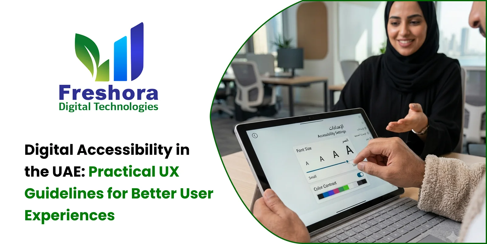
Quick Answer Digital accessibility means designing websites, applications, and digital services so... Read More

Quick Answer Bilingual UX design company creates a consistent, easy-to-use experience for people wh... Read More
Our expert will call you shortly to understand your needs and help grow your business.
Get exclusive digital marketing tips, SEO insights, web & app updates, and job opportunities delivered straight to your inbox.
Join our WhatsApp channel for instant digital marketing tips, SEO insights, web & app updates, and latest job opportunities.
Join NowFreshora Digital Technologies proudly serves businesses across Tiruchirappalli (Trichy), including Cantonment, Puthur, Thillai Nagar, Palakarai, Subramaniyapuram, Mela Chinthamani, Woraiyur, KK Nagar, Karumandapam, Crawford, Edamalaipatti Pudur (EMP), Kattur, Airport Area, Ariyamangalam, Panjappur, Thuvakudi, Tiruverumbur, BHEL Township, Srirangam, Thiruvanaikaval, Samayapuram, No.1 Tollgate, Central Bus Stand Area, and Chathiram Bus Stand Area.
We also serve clients across Tamil Nadu, India, and globally in Singapore, the UAE, Saudi Arabia, Canada, Australia, the United Kingdom, and the United States, delivering innovative Website Development, Mobile App Development, Software Development, SEO, Google Business Profile Management, and Digital Marketing solutions that help businesses grow and succeed in the digital world.

